Preto no Branco
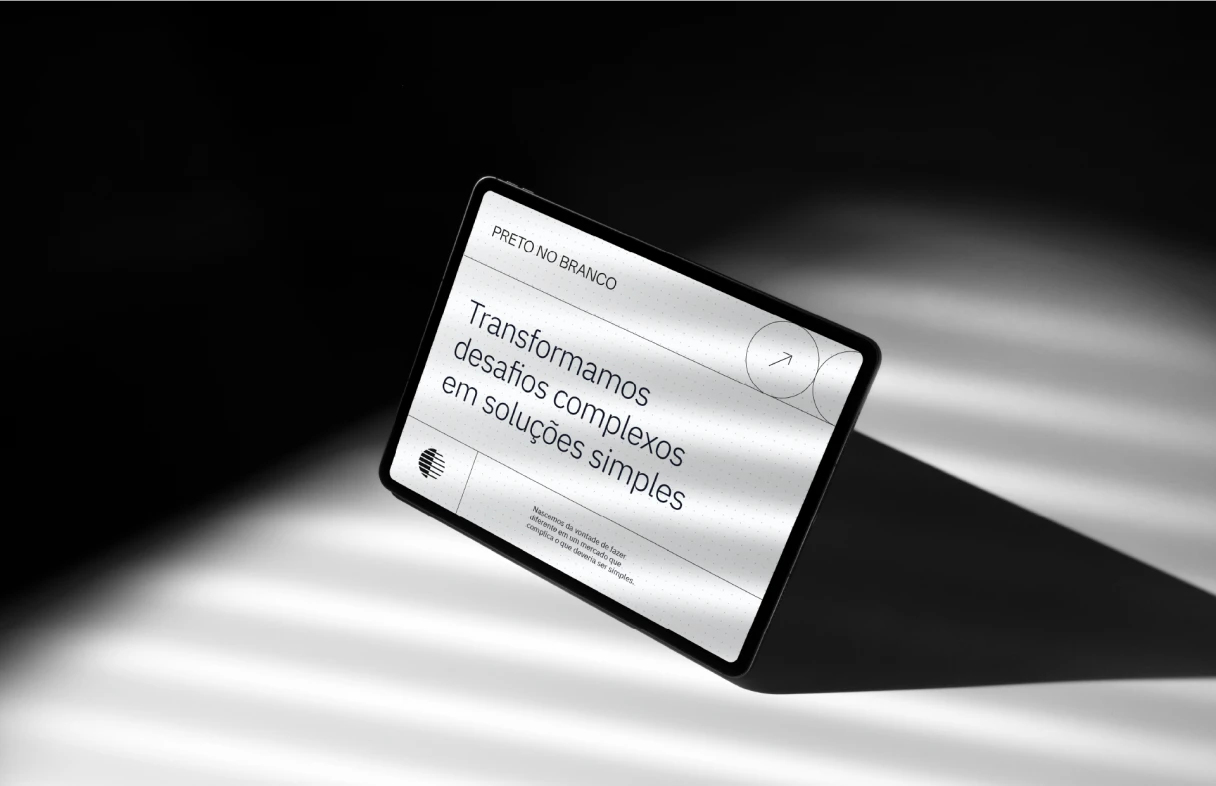
Turning complex challenges into simple solutions

- Client
- Preto no Branco
- Services
- Brand Repositioning and Visual Identity
- Sector
- Software house, Business modeling
- Location
- Porto Alegre, Rio Grande do Sul
- Year
- 2024
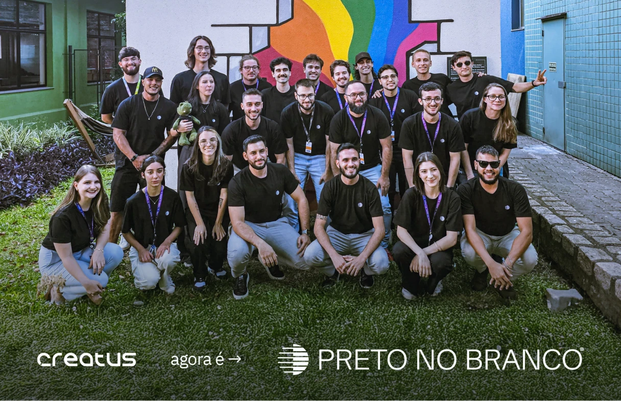
Creatus is now Preto no Branco, a company specializing in custom software development and business modeling, working in Brazil and abroad. With a team of more than 25 professionals, it serves brands such as Honda and VMI Security, and is a reference in the Tecnopuc ecosystem, with investment from Marcha, the Rede Marista fund.
The challenge was to create a new brand positioning, with a strong, memorable identity aligned with the company’s core values: transparency, objectivity and clear communication.
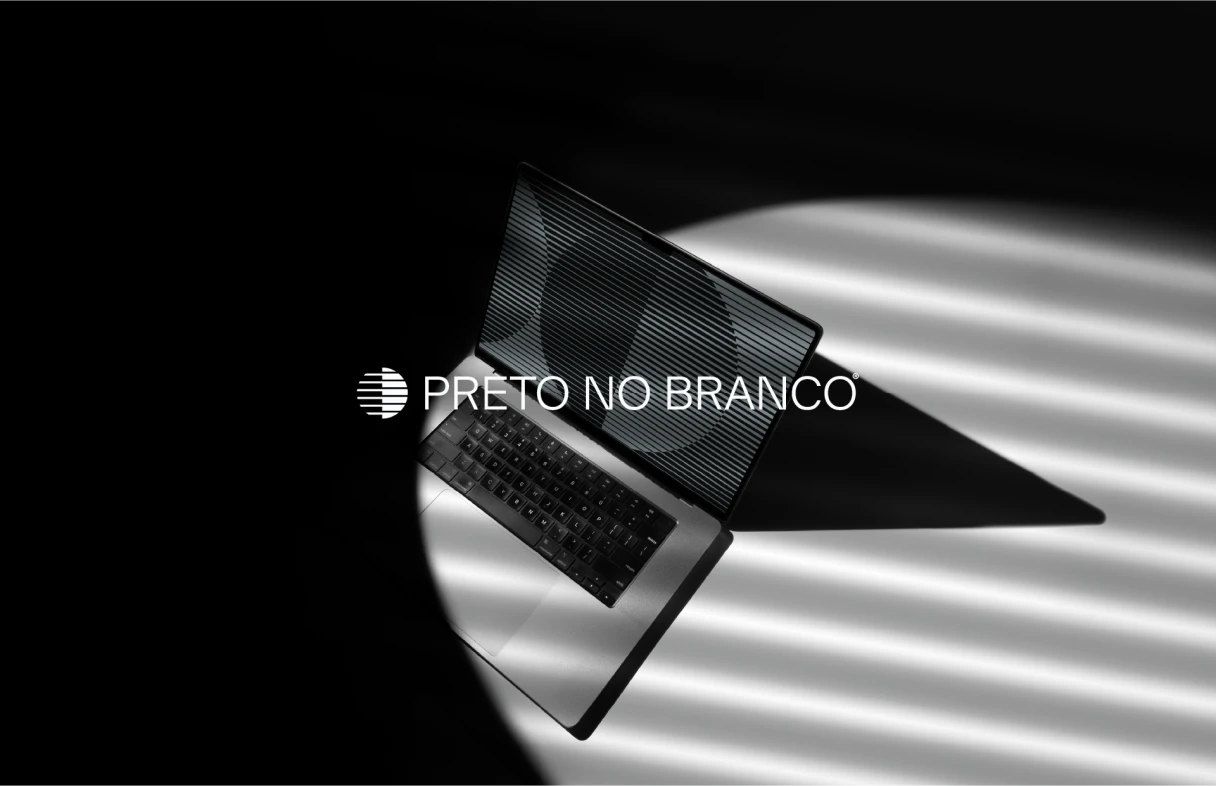
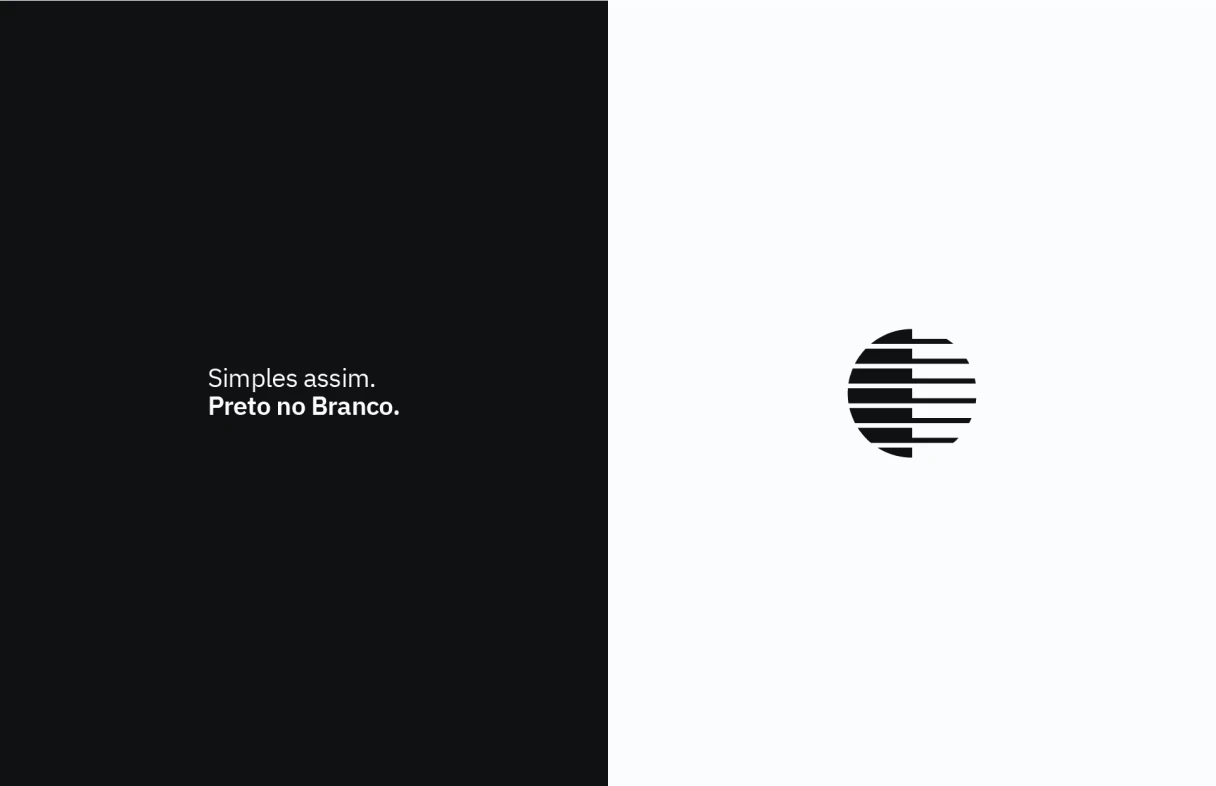
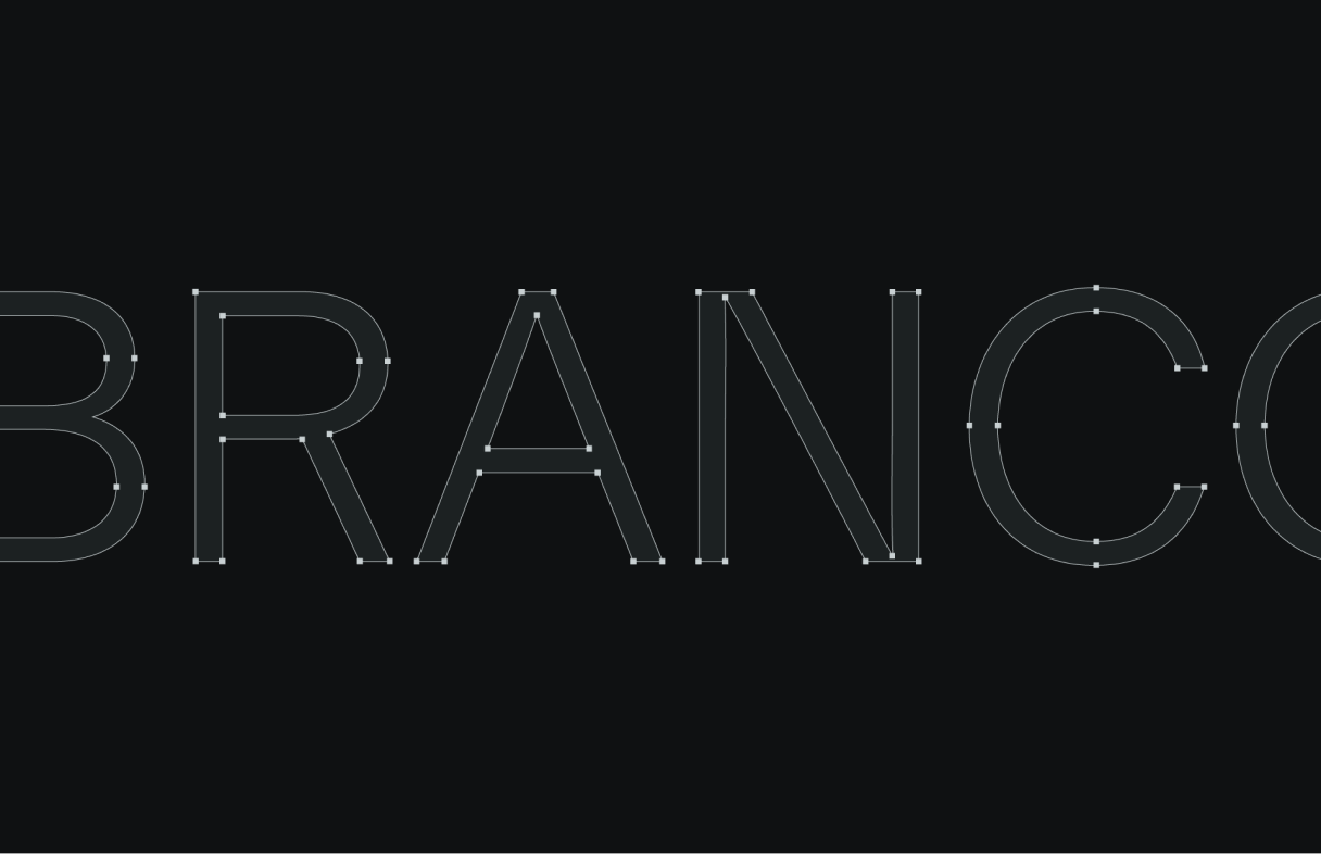
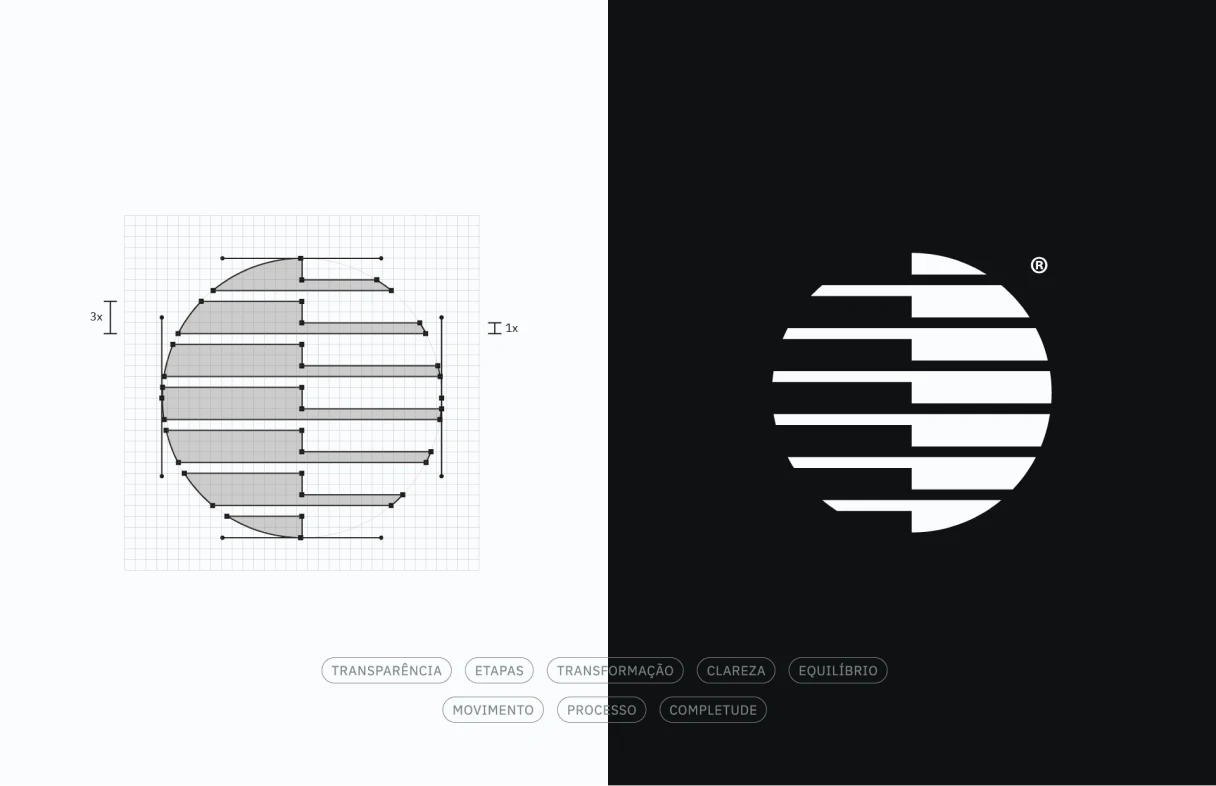
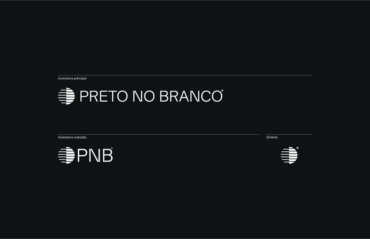
The name Preto no Branco (Portuguese for “in black and white”) was chosen because it expresses the brand’s purpose in a direct, culturally recognizable way. The visual identity was developed to reflect this concept in every element.
Symbol
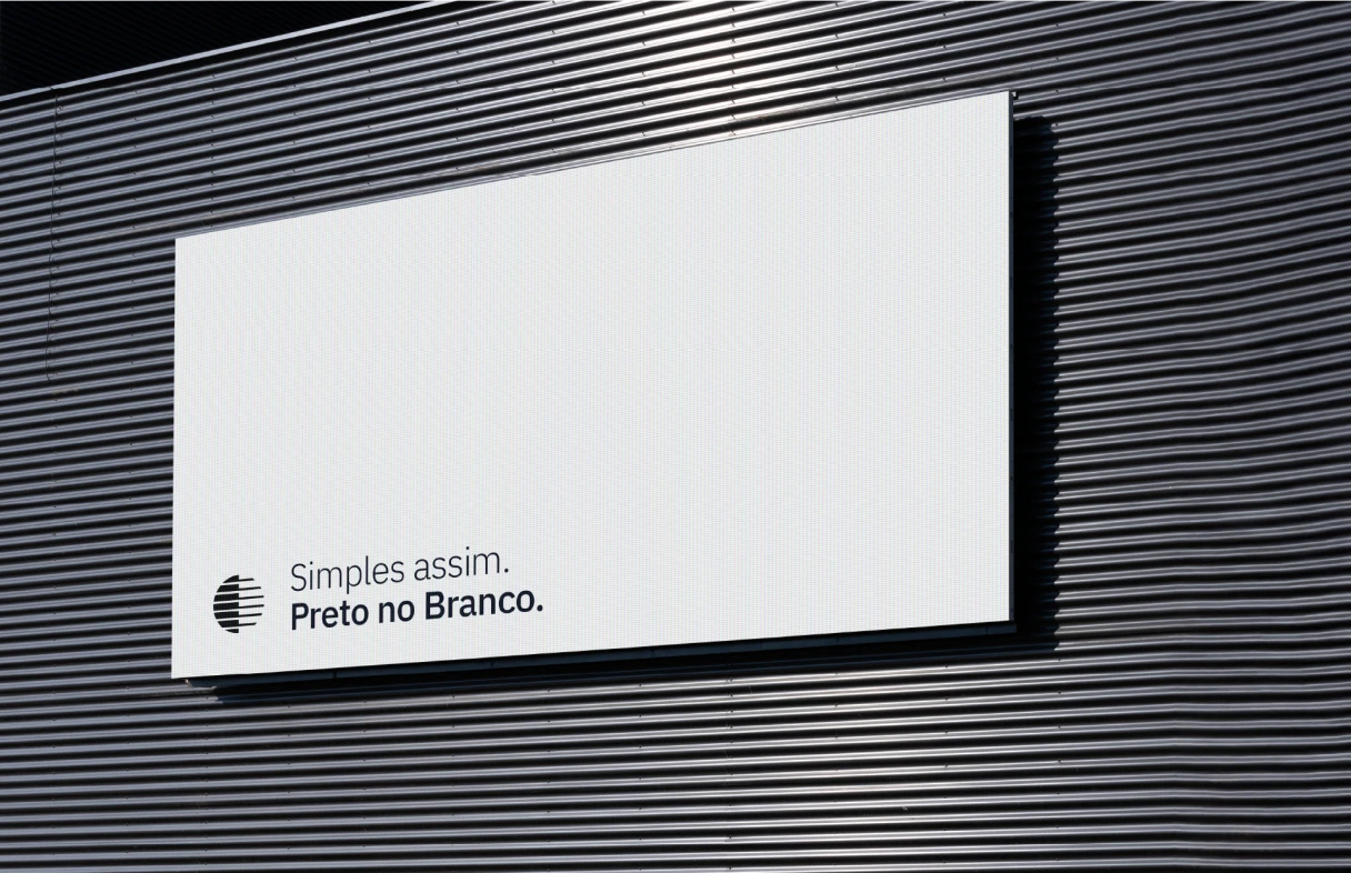
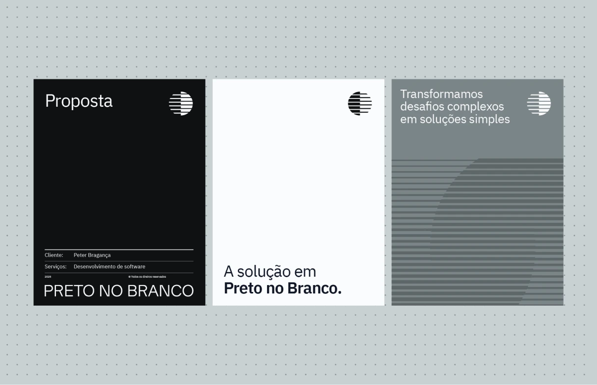
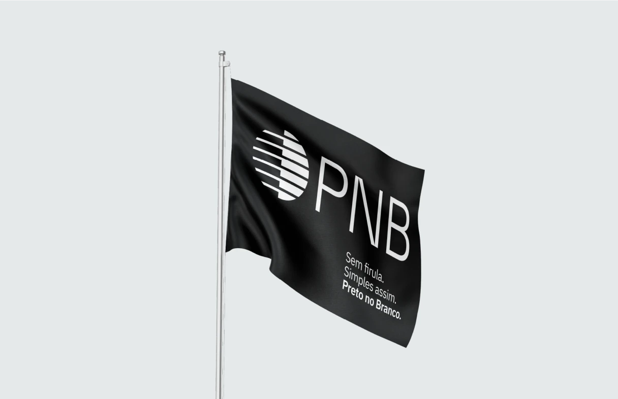
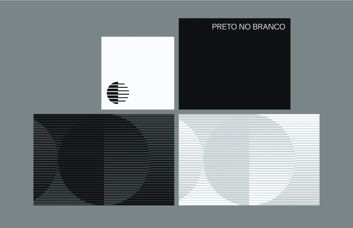
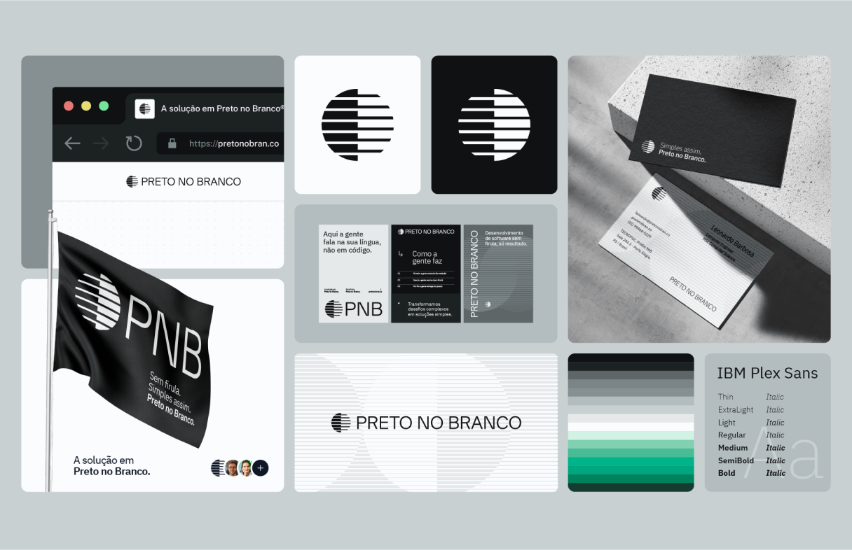
The logo is made of horizontal bands inside a circle, split in half to represent the contrast between full and empty, black and white. The mirrored design ensures the left side always represents black and the right side white, whatever the application. This symbol expresses:
- Clarity and balance
- Structure and progress
- Simplicity with intention
Visual System
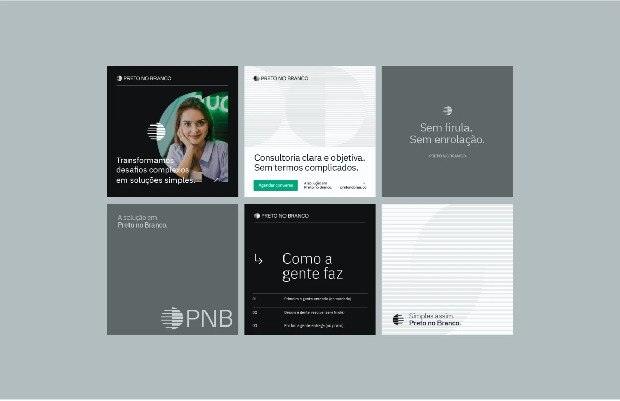
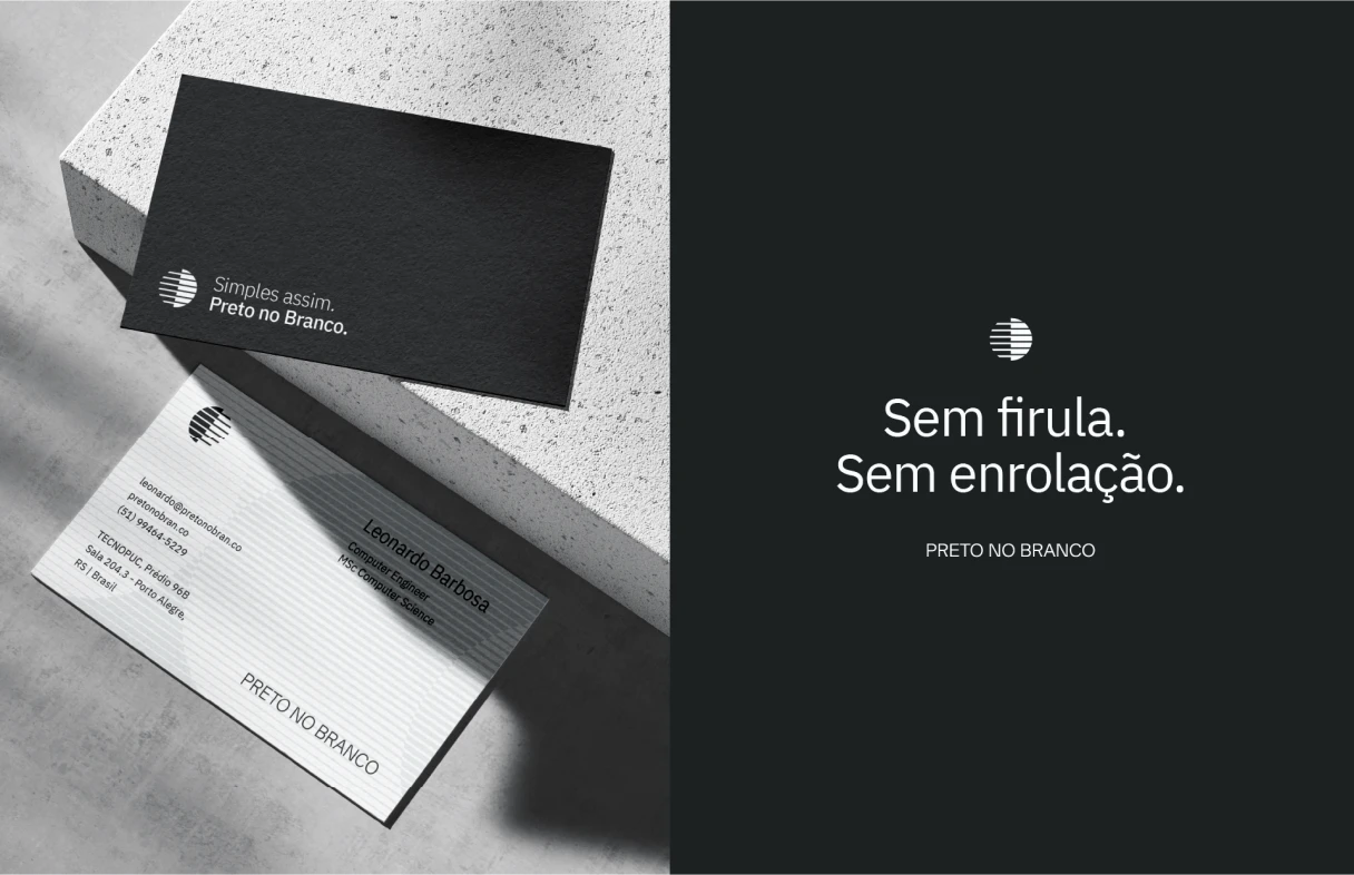
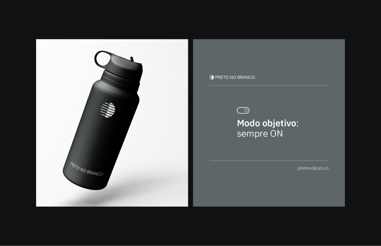
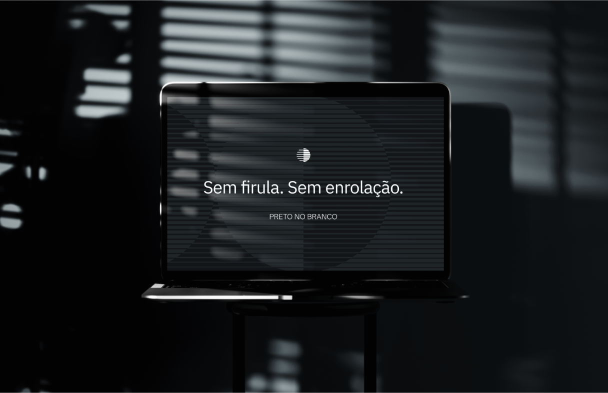
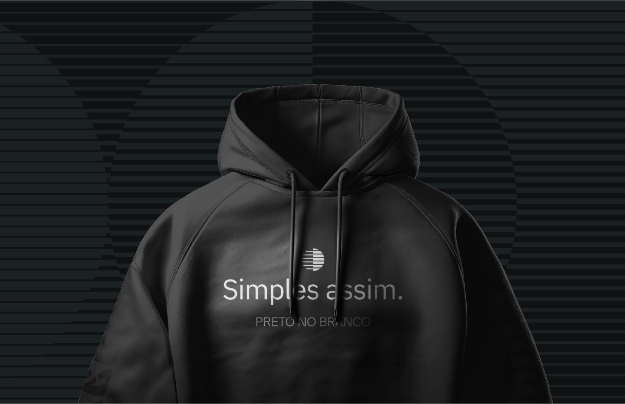
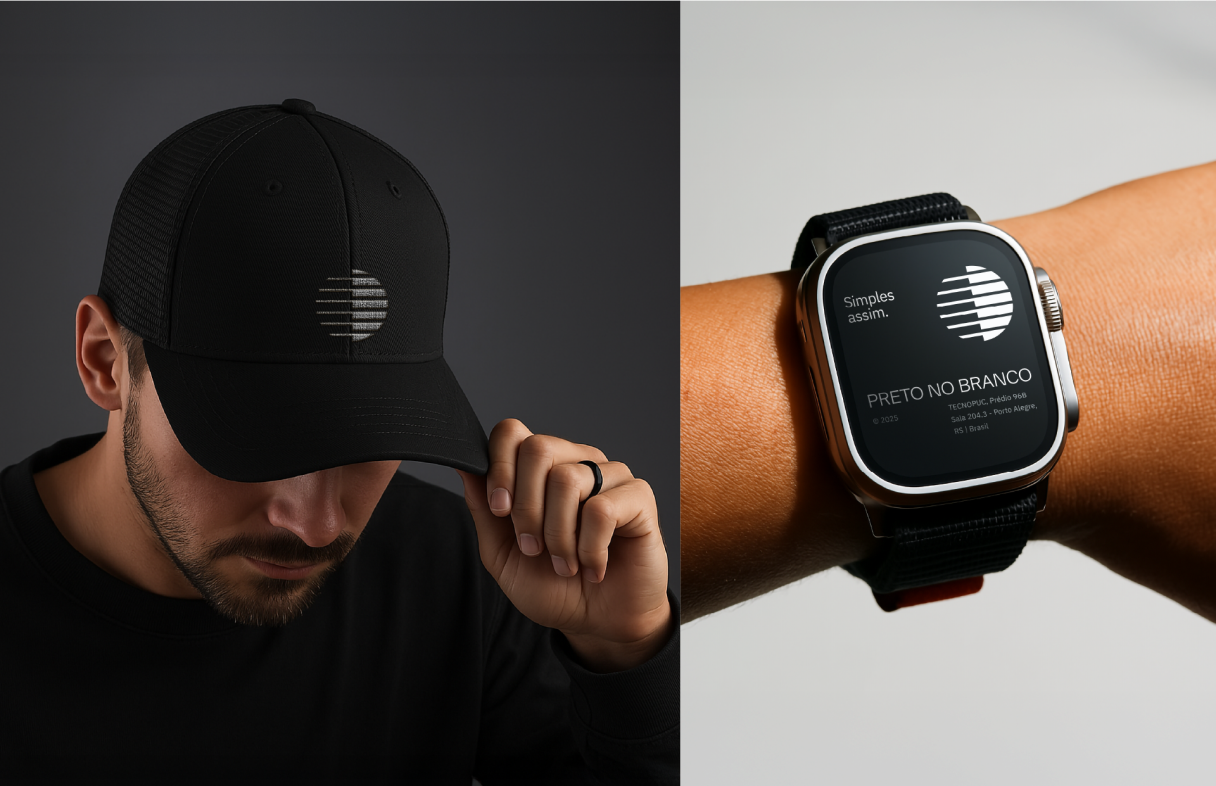
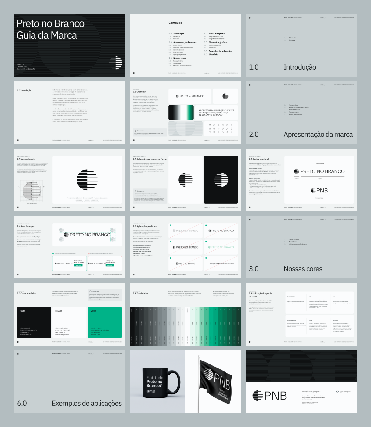
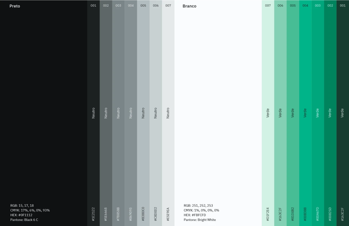
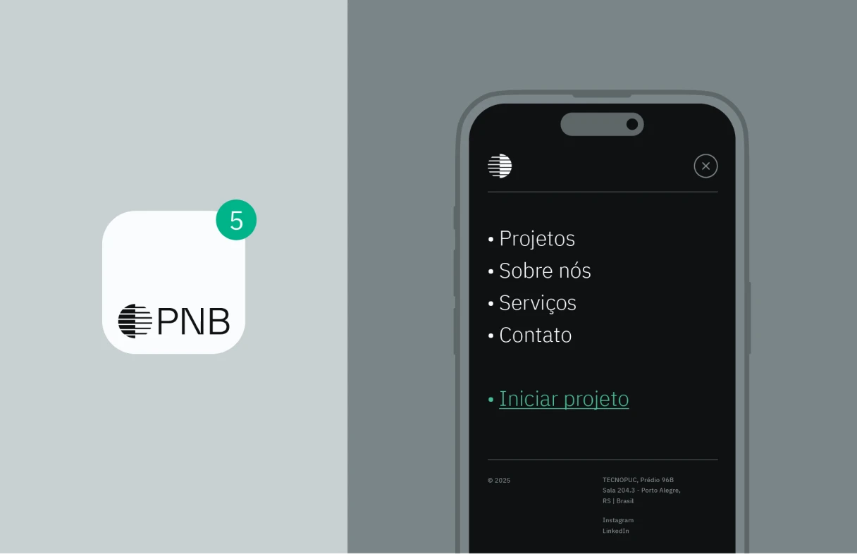
To strengthen the brand identity, graphic codes inspired by the construction of the symbol were created. These elements offer versatility and visual consistency across every application, from social media to print and digital materials.
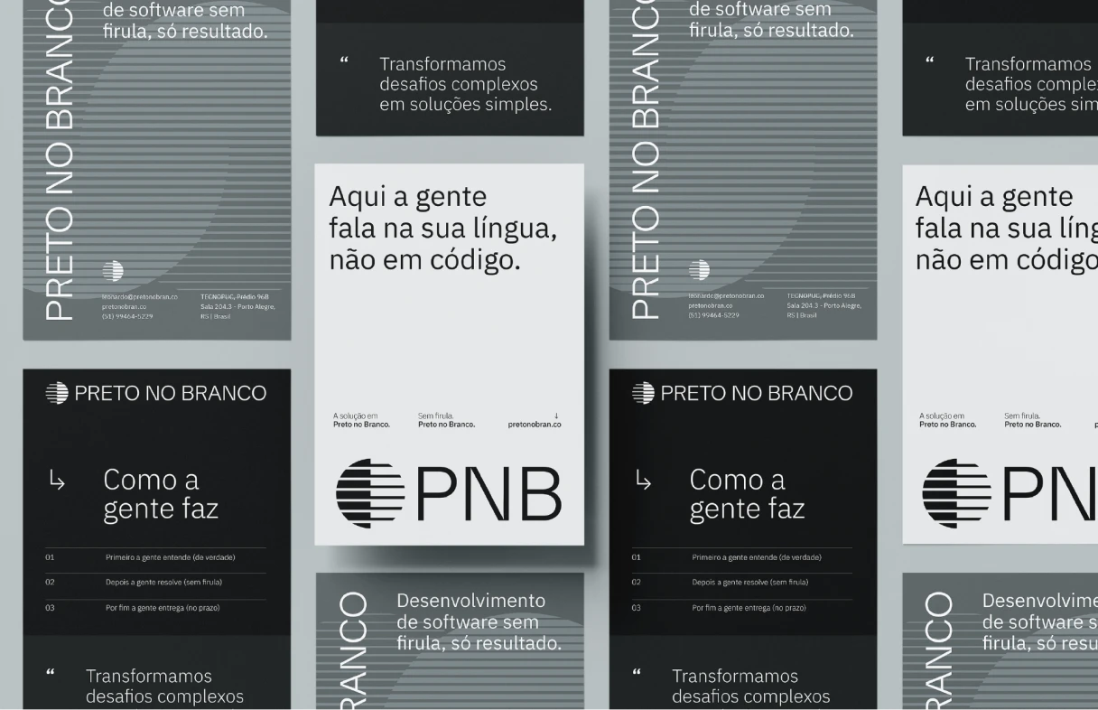
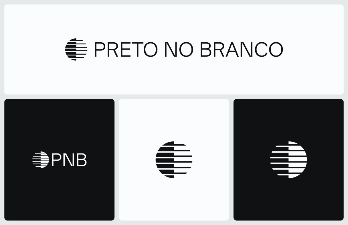
The strategic rebranding project positioned Preto no Branco as a solid brand, with coherent visual communication and clear differentiation in the technology sector. The new identity strengthens the company’s value proposition and lays the groundwork for its national and international expansion.
If it’s confusing, it’s not in black and white.
No frills. No beating around the bush. Simple as that.